The Crystal Goblet

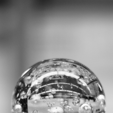
Imagine that you have before you a flagon of wine. You may choose your own favourite vintage for this imaginary demonstration, so that it be a deep shimmering crimson in colour. You have two goblets before you. One is of solid gold, wrought in the most exquisite patterns. The other is of crystal-clear glass, thin as a bubble, and as transparent.Pour and drink; and according to your choice of goblet, I shall know whether or not you are a connoisseur of wine. For if you have no feelings about wine one way or the other, you will want the sensation of drinking the stuff out of a vessel that may have cost thousands of pounds; but if you are a member of that vanishing tribe, the amateurs of fine vintages, you will choose the crystal, because everything about it is calculated to reveal rather than hide the beautiful thing which it was meant to contain.

Bear with me in this long-winded and fragrant metaphor; for you will find that almost allthe virtues of the perfect wine-glass have a parallel in typography. There is the long, thinstem that obviates fingerprints on the bowl. Why? Because:
NO CLOUD MUST COME BETWEEN YOUR EYES AND THE FIERY HEART OF THE LIQUID.
Are not the margins on book pages similarly meant to obviate the necessity of fingering the type-page? Again: the glass is colourless or at the most only faintly tinged in the bowl, because the connoisseur judges wine partly by its colour and is impatient of anything that alters it. There are a thousand mannerisms in typography that are as impudent and arbitrary as putting port in tumblers of red or green glass! When a goblet has a base that looks too small for security, it does not matter how cleverly it is weighted; you feel nervous lest it should tip over. There are ways of setting lines of type which may work well enough, and yet keep the reader subconsciously worried by the fear of 'doubling' lines, reading three words as one, and so forth.

THERE ARE A THOUSAND MANNERISMS IN TYPOGRAPHY THAT ARE AS IMPUDENT AND ARBITRARY AS PUTTING PORT IN TUMBLERS OF RED OR GREENGLASS!
When a goblet has a base that looks too small for security, it does not matter how cleverly it is weighted; you feel nervous lest it should tip over. There are ways of settinglines of type which may work well enough, and yet keep the reader subconsciously worriedby the fear of 'doubling' lines, reading three words one, and so forth
Now the man who first chose glass instead of clay or metal to hold his wine was a 'modernist' in the sense in which I am going to use that term. That is, the first thing he asked of his particular object was not 'How should it look?' but 'What must it do?' and tothat extent all good typography is modernist. Wine is so strange and potent a thing that it has been used in the central ritual of religion in one place and time, and attacked by a virago with a hatchet in another. There is only one thing in the world that is capable of stirring and altering men's minds to the same extent,and that is the cherent expression of thought.

That is man's chief miracle, unique to man. There is no 'explanation' whatever of the fact that I can make arbitrary sounds which will lead a total stranger to think my own thought. It is sheer magic that I should be able to hold a one-sided conversation by means of black marks on paper with an unknownperson half-way across the world. Talking, broadcasting, writing, and printing are all quiteliterally forms of thought transference, and it is the ability and eagerness to transfer and receive the contents of the mind that is almost alone responsible for human civilization.