The Web's Grain

Can I play something for you? Trust me: it’s worth it. Oh, and while you’re listening, pay attention to your chest. You may feel a growing warmth, kind of like the firey trickle after a shot of whiskey.


All right, here we go:

Wasn’t that great? I’ve listened to those irritating bing-bongs 30 or 40 times in the process of making this page, and while you can’t see it, I’m typing this with a big, stupid smile on my face. If you came online in the ’90s like me, you’re probably smiling too.
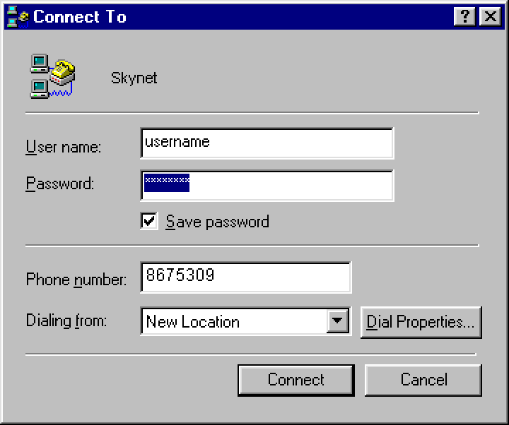

Windows 95 Dial-Up Dialog Box

That sound, of course, is the audio handshake of a modem connecting to the internet. And the fiery feeling in the chest it creates is the warm pang of nostalgia. I’ve managed to tether that grating sound to all the wonder and magic I felt my first years on the internet. Back then, if you told me that I’d get to spend the next decade or so making things for the web—well, that would be just about the best news I could be told.


But things have changed, as they always do. I’m writing this fifteen years after the bing-bongs, and the fascination has faded. What happened is what always happens: the wonder I felt was diminished by experience.


The awe goes—time takes it.

There’s a quote from the French philosopher Gaston Bachelard. He says:

“We begin in admiration and end by organizing our disappointment.”

Now, this is a bit pessimistic—he is a French philosopher, after all—but right now the statement does ring true for the technology industry. Think about the weight we’ve added to the world: attention-greedy devices and services, new business structures that turn out to reinforce existing inequalities instead of working against them, technocratic blowhards, never mind the surveillance shit storm we all now must navigate.


How could any self-aware person who works in technology not start to organize their disappointment? It’s gotten to where several of my peers are floating half-hearted speculations about their next careers. This isn’t good: you want the talented and mindful people to stick around, not get husked out, then leave frustrated, exhausted, and conflicted.


The closer I get to it all, the more I become confused and overwhelmed. A thing I knew so well has reached out wider and wider, only to make less and less sense. So last year, instead of being stubborn, complaining, or feeling powerless, I went searching for a different perspective. I wanted to take something big and make it small again. This was urgent: I needed a way to re-engage with my craft on a foundational level. Otherwise, I’d also be looking for a second career.

It is what it is

South China Sea by Toby Smith

In Buddhism, there’s something called the beginner’s mind. If you’ve ever done any kind of guided meditation, you’re probably familiar. It refers to having an attitude of openness, of eagerness. You drop your heavy preconceptions and revitalize a practice by finding a new way to look at it. Making things for the web started to feel very heavy to me, so this seemed to be what I needed.


Most investigations into beginner’s mind eventually lead to the same zen koan. It’s a small story, and it goes like this:

Before I began to practice, mountains were mountains and rivers were rivers.


After I began to practice, mountains were no longer mountains and rivers were no longer rivers.


Now, I have practiced for some time, and mountains are again mountains, and rivers are again rivers.

So what’s the lesson? Here’s my take: we eventually work through the naive belief that profundity comes from complication. It simply isn’t so. Things have enough depth and worth on their own terms. No metaphors or analogies are needed for insight, only the willingness to listen to the subject speak for itself, even if it contradicts received wisdom.


I’d like to do some listening today.


What is there to see when you look at a website as itself? A lot, actually, but let’s simplify things down to their core. As we go through this, please excuse me for stating the obvious. My intent is to describe and document the apparent. Rivers as rivers, remember?


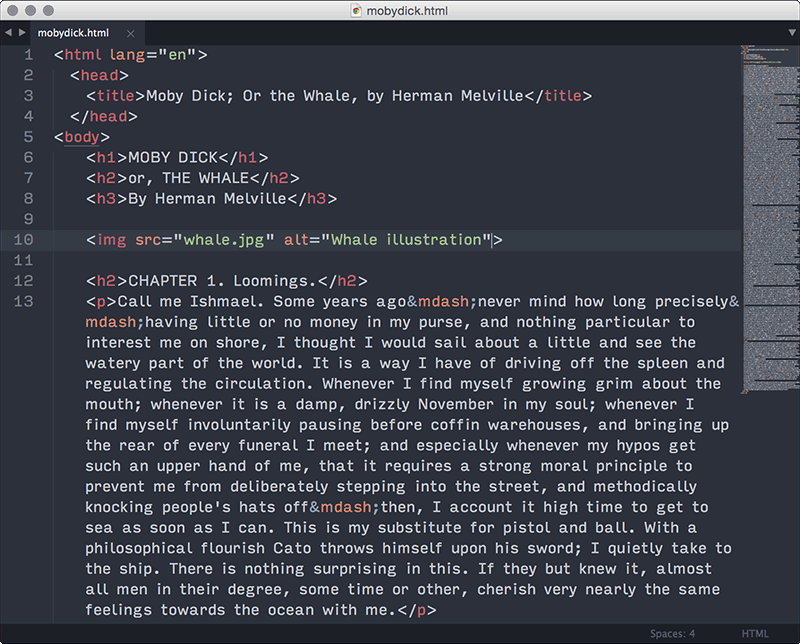
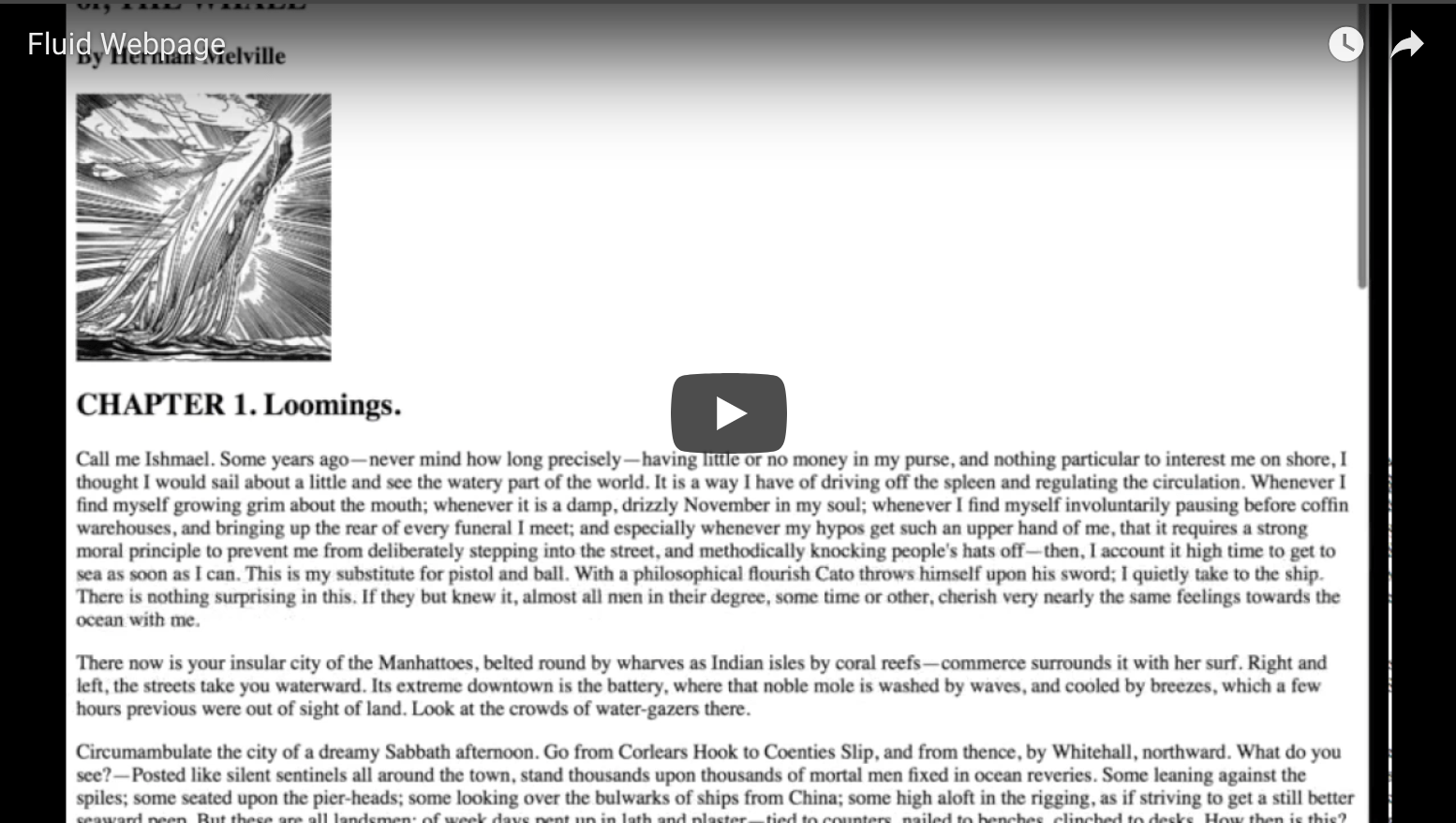
Here we have a very vanilla website. No styles, just markup. All defaults.

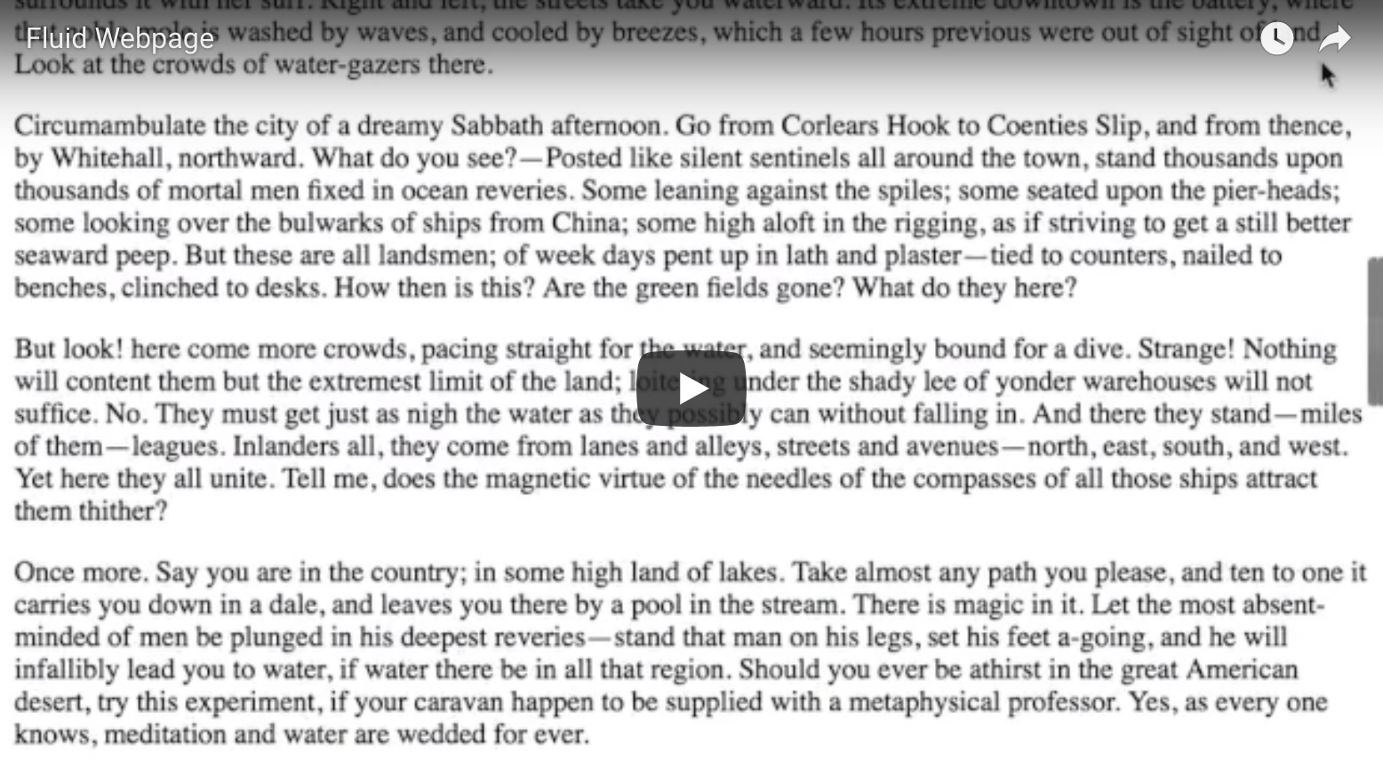
The first thing to notice about this page is that it is fluid—it adapts to the width of the viewport to fill it up. We can’t quite say it’s responsive, because responsive sites require media queries, but this site, like a responsive one, isn’t opinionated about the size of the viewport. It works well at whatever size you throw at it.


The page’s fluidity leads to the second thing to notice: the page is vertical.


Okay, terribly obvious, but let’s tease this apart.


Elements get stacked like a layer cake by default, and it make sense—vertical stacks are much easier to adapt across all kinds of screen sizes, because you don’t have layout issues to manage with more or less space across. You simply keep the elements the full width. This is especially handy for design methods like mobile first, since narrower screens can’t necessarily hold designs where elements are beside one another. By stacking, you get greater consistency in a design, what ever the screen size.


But not every site can be a big vertical stack of bricks, can it? What happens if you place things side-by-side?

This leads us to the primary visual challenge of responsive design.

It’s the big daddy, the ur problem, the foundational thorn in your side that, for some reason, I have never seen documented.


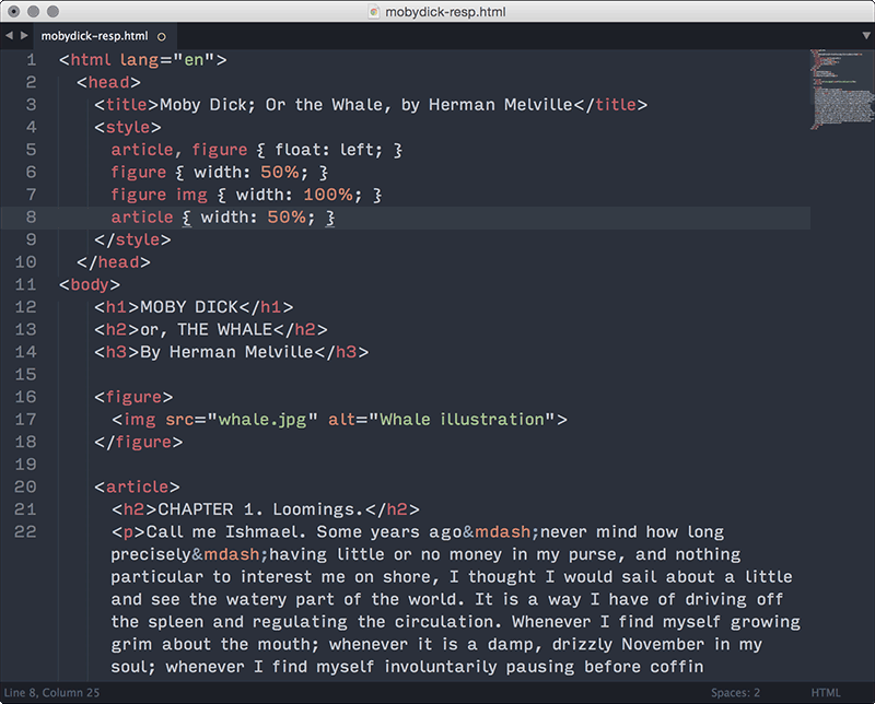
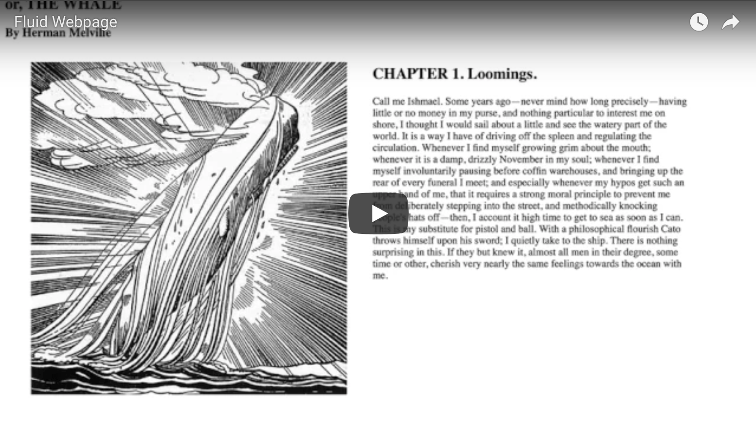
I’m going to go back to my vanilla HTML page, but let’s add a couple lines of CSS so that our image is beside the text, and both scale in width as the viewport changes.

Okay, take a look:


I’ll explain what’s happening. When I change the window width, the image gets taller as it gets wider, because its proportions are fixed. The text, on the other hand, gets shorter as it gets wider since it has no fixed proportions.


If you’ve ever designed a responsive website, this is the source of all your sadness. This is the fount of your tears, the wellspring of your suffering. If you believe in the afterlife, this is the circle of hell where they light the soles of your feet on fire.


You know how people say to add a breakpoint to a responsive design when the layout starts to look weird? This is the thing that makes the layout look weird. Every time. But, this contradiction is unavoidable and unsolvable, so the only choice is to recognize it as implicit to the medium, and devise strategies to manage it.